Guiding Player Decisions Through Visual Elements in Online Slot Games
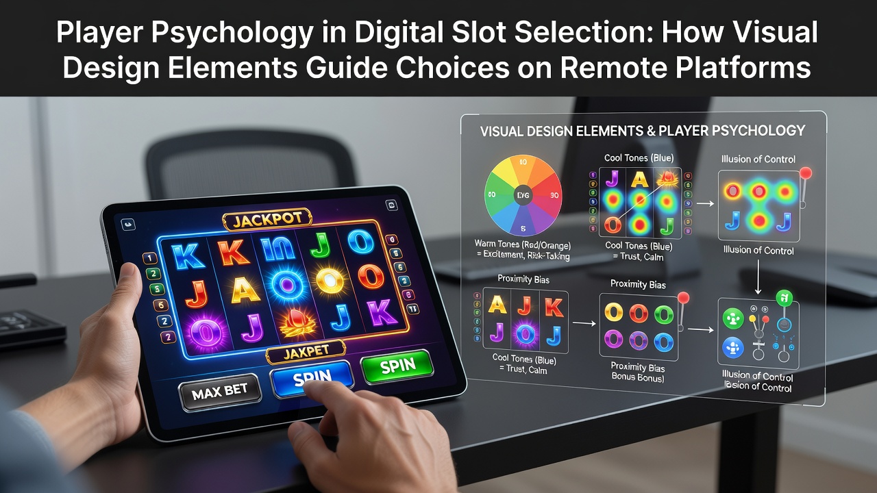
Remote slot platforms rely on layered visual components that direct attention and influence selection patterns among users, and researchers have documented how these elements interact with cognitive processes to shape initial game picks as well as continued engagement. Color palettes often serve as the first point of contact, where high-contrast hues combined with warm tones draw the eye toward specific reels while cooler backgrounds create a sense of depth that encourages longer viewing sessions. Animations play an equally central role because micro-movements such as spinning symbols or subtle glow effects around winning lines activate reward pathways that reinforce the decision to stay with one title over another.
Studies in cognitive psychology indicate that near-miss visuals, where symbols stop just short of a payout line, increase the perceived closeness to success and prompt repeated selections even when payout ratios remain unchanged. Platform developers integrate these patterns deliberately because data from multiple markets shows elevated click-through rates on games featuring dynamic reel stops and cascading symbol sequences. Layout hierarchy further guides choices since larger central reels framed by smaller side panels create a focal point that reduces decision fatigue for users scanning dozens of available titles.
Color and Contrast as Attention Directors
Design teams select palettes based on established associations between hue and emotional response, and evidence from cross-regional gaming reports demonstrates that reds and golds consistently correlate with higher initial selection rates compared with muted schemes. Background gradients that shift during bonus rounds add temporal variety which sustains interest without requiring active user input. Observers note that contrast ratios between symbols and reels affect readability on smaller screens, a factor that becomes critical as mobile participation continues to expand in markets tracked by regulators outside the United Kingdom.
Animation Patterns and Reward Anticipation
Fluid reel spins paired with anticipatory pauses before final stops create rhythmic expectations that mirror patterns observed in laboratory studies of variable reward schedules. These sequences appear across platforms licensed in multiple jurisdictions, and figures from industry analyses reveal that titles incorporating escalating animation intensity during feature triggers maintain longer average session durations. Subtle particle effects or expanding wild symbols introduce novelty that resets attention cycles and reduces the likelihood of immediate game switching.
Symbol Design and Thematic Cohesion
Consistent iconography within a single game strengthens narrative immersion, while mismatched visual styles across different titles can prompt quicker exits according to eye-tracking data collected during usability tests. High-detail symbols rendered with metallic or jewel-like finishes tend to signal premium positioning, and users often associate such aesthetics with elevated payout potential even when mathematical return-to-player percentages are identical. Thematic alignment between background art, reel symbols and sound cues reinforces memory encoding which later influences repeat selections when users browse libraries again.

Platform algorithms also surface games based on visual performance metrics, and data compiled by research groups in North America and Australia shows that visually distinctive titles receive disproportionate exposure in recommendation carousels. This feedback loop amplifies the initial psychological impact of design choices because greater visibility leads to more opportunities for the visual elements to exert influence.
Interface Layout and Decision Architecture
Grid arrangements that prioritize featured games at the top of category pages reduce cognitive load by limiting the number of simultaneous options under consideration. Scroll-triggered animations that reveal additional titles only after initial selections occur help maintain flow and prevent early abandonment. Those who have examined player navigation logs report that games positioned near call-to-action buttons or within highlighted banners experience elevated selection volumes regardless of underlying volatility levels.
Accessibility features such as adjustable contrast modes and simplified symbol sets expand the reach of visual design tactics to broader audiences, and compliance frameworks in several Canadian provinces require these adaptations while still preserving the core psychological cues. The result is an environment where design elements operate consistently across devices yet adapt to individual viewing conditions.
Emerging Trends Observed by Mid-2026
By June 2026 developers had begun integrating adaptive visuals that respond to detected play patterns in real time, adjusting color saturation or animation speed based on session length indicators. Early deployment data from operators in regulated European markets suggests these responsive layers further refine the guidance of player attention without altering core game mathematics. Cross-platform testing continues to verify that such personalization maintains effectiveness when users switch between desktop and handheld interfaces.
Conclusion
Visual design elements function as structured guides within remote slot environments because they align with documented patterns of visual processing and reward anticipation, and ongoing research from institutions across North America, Europe and Australia continues to map these interactions. Platform operators apply findings from eye-tracking studies and behavioral datasets to refine layouts, color usage and animation timing, producing selection environments that feel intuitive while directing attention toward targeted titles. The cumulative effect remains measurable through aggregated engagement metrics that reflect both initial choices and sustained play across diverse regulatory landscapes.